Abstract Wall Art — Warm Terracotta, Cream & Charcoal Geometry for Thoughtfully Styled Spaces
Abstract Wall Art — Warm Terracotta, Cream & Charcoal Geometry for Thoughtfully Styled Spaces
Couldn't load pickup availability
EARTHEN COLOR · SOFT GEOMETRY · EVERYDAY ESCAPE
🌅 A Little Sun-Warmed Stillness, Framed for Your Favorite Space
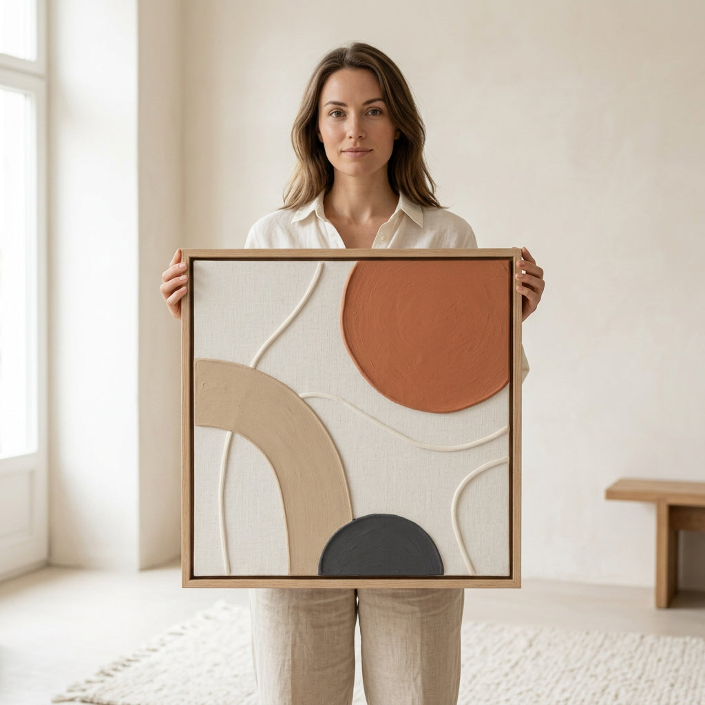
Some rooms do not need more furniture. They need a moment that brings everything together: a warm accent, a softer line, a reason for your eye to linger. The abstract wall art introduces that moment through an abstract composition of terracotta, sandy beige, creamy white, and deep charcoal. It is expressive without feeling busy, understated without disappearing into the wall.
A generous rust-orange shape settles into the upper corner like a sun just beyond the horizon. A broad, pale arch rises from the opposite side, while a dark rounded form anchors the lower edge. Between them, fine wandering lines cross an open, light-colored field. The result is a visual conversation between warmth and restraint, curves and corners, movement and quiet.

A closer look at the composition: grounded color, open space, and curves that lead the eye.
🎨 Four Colors. One Beautifully Balanced Conversation.
Terracotta: the warm focal point
The large orange-brown form gives the artwork its distinctive warmth. Its softened outline feels more relaxed than a rigid geometric circle, introducing an earthy note that works beautifully beside cinnamon cushions, clay-colored accessories, warm leather tones, or a single amber glass vase. It is the accent that gives a neutral room a little more personality.
Sand: the gentle connecting shape
The pale beige arch sweeps across the lower-left portion of the composition. Its broad band introduces movement without sharpness, echoing the rounded forms often found in curved seating, arched mirrors, and softly shaped ceramics. Against the cream background, it creates a subtle contrast rather than a hard interruption.
Cream: space for the eye to rest
The light background is an essential part of the design, not simply empty space. It separates the stronger forms and keeps the overall arrangement feeling airy. This makes the palette especially easy to imagine alongside ivory textiles, oatmeal upholstery, pale walls, and warm natural-looking finishes.
Charcoal: a small detail with grounding presence
The dark semicircular form near the base adds visual weight and contrast. It gives the warmer colors something to lean against, while offering a natural connection to black lamp stems, dark picture frames, charcoal throws, or slim metal furniture details already in your room.
〰️ Follow the Lines. Discover the Quieter Details.
From across the room, you notice the bold shapes first. Move closer and the finer details begin to emerge. The product photographs show delicate, raised-looking curved lines traveling across the pale field, along with a textured appearance within the colored areas. These details interrupt the larger blocks of color just enough to make the composition feel layered and visually engaging.
The light wood-tone border shown in the photographs adds another warm outline around the arrangement. Its straight edges contrast with the artwork’s flowing forms, keeping the piece visually contained without competing for attention. Together, the border, soft palette, and textured-looking surface create an appealing balance between clean structure and organic character.

The detail view highlights the surface appearance and the contrast between precise edges and softer lines.
🌿 Style a Feeling, Not Just a Wall
Think of this artwork as a starting point for a room that feels considered rather than crowded. You do not need to match every shade exactly. Repeat one warm tone, add one contrasting dark detail, and allow the rest of the space to breathe.
The slow-morning living room
Pair the palette with an oatmeal sofa, a sand-colored throw, and a small terracotta accent on a nearby table. A charcoal cushion can pick up the darker form in the artwork, while a leafy plant introduces a fresh counterpoint. The combination feels warm and lived-in, with enough variation to avoid looking overly coordinated.
The quietly welcoming entryway
Use the console scene in the photographs as styling inspiration: a simple wood-toned surface, an off-white vase, and a few branches. Keeping surrounding objects low and uncomplicated allows the artwork’s geometry to remain the focal point. It is a lovely direction for an entrance that should feel composed, welcoming, and personal.
The softer bedroom corner
Imagine cream bedding, muted caramel accents, and a gentle pool of light from a bedside lamp. The artwork’s earthy colors can add warmth without introducing an overly bright or restless pattern. Repeat its rounded forms through a curved lampshade or a softly shaped decorative bowl for a subtle sense of continuity.

Room-styling inspiration: warm neutrals, simple greenery, and space around the artwork.
☕ Imagine Coming Home to This
The door closes behind you. Your bag lands beside the sofa, the kettle begins to warm, and the room starts to feel like yours again. Across the space, a terracotta curve catches your attention. The pale arch echoes the softness of your favorite chair. A small dark shape ties in with the lamp you have owned for years. Nothing feels dramatically changed, yet the room feels more complete.
That is the appeal of an expressive piece with a restrained palette. It does not need every object around it to be new. It gives the things you already love a shared visual language, bringing warmth to the practical corners and personality to the quiet ones.
🔎 A Few Thoughtful Styling Notes
Start with proportion. Before choosing a position, measure your available wall area and compare it with the confirmed product dimensions. Lifestyle photographs are useful for mood and arrangement, but should not be used as a scale reference.
Let the palette do the work. Choose two supporting colors from the artwork rather than repeating every shade throughout the room. Cream and terracotta create a warmer look; beige and charcoal feel a little more restrained.
Give the composition breathing room. An uncluttered surrounding area helps the fine lines and open background remain visible. If you are planning a larger arrangement, pair it with quieter neighboring pieces rather than several equally bold patterns.
Check the practical details. Refer to the confirmed product options for dimensions, materials, frame inclusion, and installation requirements before ordering. Colors can appear different across screens and lighting conditions. Furniture, plants, and decorative accessories in the room scenes are styling references.
✦ Make Room for Warmth. Make It Feel Like You.
You do not have to choose between an expressive home and a restful one. The abstract wall art brings together earthy color, flowing geometry, and an inviting sense of balance, giving your space a focal point that feels distinctive without taking over.
Picture it beside the textures you already love. Let the terracotta bring warmth, the cream create breathing room, and the charcoal add a little definition. Then build the rest of the story your way.
Bring the abstract wall art into your space and give your everyday surroundings a warmer point of view.